Tuesday, 30 October 2007

Week 4

So far this week we have had our formattive assessment with Mike Smith, and we got some positive feedback as to the progress of our project. For week 9 there are big targets for us to meet, one of them being a finalised character models for all our characters as well as all of our environments finalised in concept as well. So at the moment I am working on some concept work to help further the progress for the group this week


1950's women research


This is some research I have done on the 1950's man! This was some inspiration for me drawing this character below


As well as looking at the overall style of the 50's man I have also researched on their distinctive hairstyles of the time


Taking all of this into consideration this is my character for the young man


Boulangerie Concept

Monday, 22 October 2007

Week 3

Following our meeting today, there have been some changes to the characters. Our Cat which we had as a companion for Ginnette is now a dog.This week we have spent the majority of our time finishing off our storyboards which I am happy to say we completed.

Here's some general research on different breed dogs:


It is important to have the right breed dog that best reflects the grandma's character. Below I have also looked at different ways to represent real dogs in a cartoon format across many breeds of dogs. This gives you an intresting insight as to how the dogs may look as cartoon characters.


You really get a sense of character across this page. Some dogs look more realistic than others but it is clear to see the character of the dogs shine through whatever pose their in

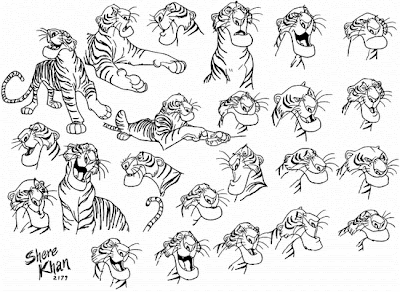
I have looked at various styles and designs for animal character sheets, for when we make a decision on what the dog will look like for the grandma!


Here are some dog concepts I drew myself:


Below I have given the dog more of a french touch by giving it a beret and a t-shirt.


Just playing around with colour, but it hekos give a real sense of character


I have also gone on the internet to look at some intresting dog animations. Theres a lot of exaggerated movement which is ideal for our own dog in our animation. The secondary animation is also very key to adding a professional final touch to the animation piece. Character is everything


Thursday, 18 October 2007

Week 2

One of the things we had to do this week was go through our whole list of objects that will be in every scene and get visual research. Below you will see all the contact sheets I did for each scene, you will find images that intrested me, but the final contacts sheets will be decided by the whole group when we go through all our research together.


Street Contact Sheet


Paris Contact Sheet


Boulangerie Contact Sheet


Basment Contact Sheet


Apartment Contact Sheet


Apartment building research


I have also done some apartment building research! what is interesting to see is that the mjority of apartment buildings are quite long and narrow with a lot of high ceilings. They are mainly built on narrow streets as well, which I think predetermines the size of the apartment buildings


Apartment Concept

Some of the items in this apartment are in accordance to what we as a group agreed to be in the apartment


Sunday, 14 October 2007

Week 1 Overview

Week 1

We have had productive meetings, and one of the driving forces of this animation is style. As we are going to have watercolor backgrounds mixed in with 3 dimensional characters, our references have to be strong!. I have picked some intresting painting styles to be looked at, but we have to keep our painting styles consistant throughout


The style on the left is very watered down, whereby the painting on the right has more block colours and a heavier coat of paint. The piece on the right is more abstract which may not be as suited to our animation as the purple watered down painting


The style on the right most intrests me because it is a combination of watercolor and black ink. It gives the pice an illustrative look, that stands out more of the two paintings


More intresting styles to be considered


This is another example of a wtercolor painting with an illustrative style. The use of ink may be probable but the general idea is that the lines are fine and crisp with a drak edge which gives it a more detailed look, which is what I am really intrested in